Party Candles and Matches
Cake decorating is a mix of fun and chaos. You’ve got to pick a theme, order or bake the cake, and don’t forget the candles! But when it’s time to light them, you realize you’re missing one crucial thing—something to actually light them with.
That’s why I designed this all-in-one package with candles and matches. The cylindrical shape not only looks eye-catching but also serves a purpose: it provides a sturdy base to protect the candles. Plus, it allows space for a matchbox cleverly shaped like a cake slice that fits right into the side. One side showcases a cake-filling pattern that mirrors the candle holder, while the other has the match strike. The clear plastic lid makes it easy to store any leftover candles and matches for your next celebration!
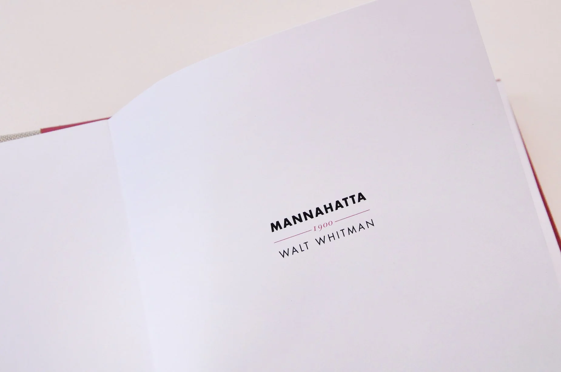
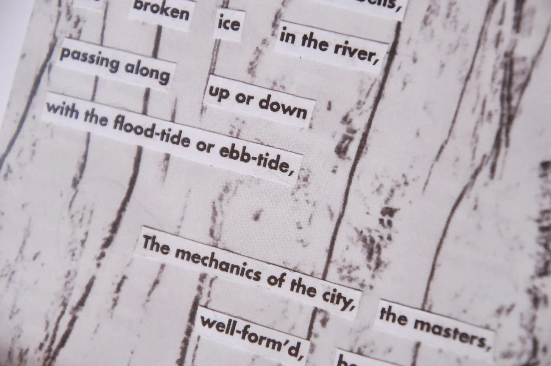
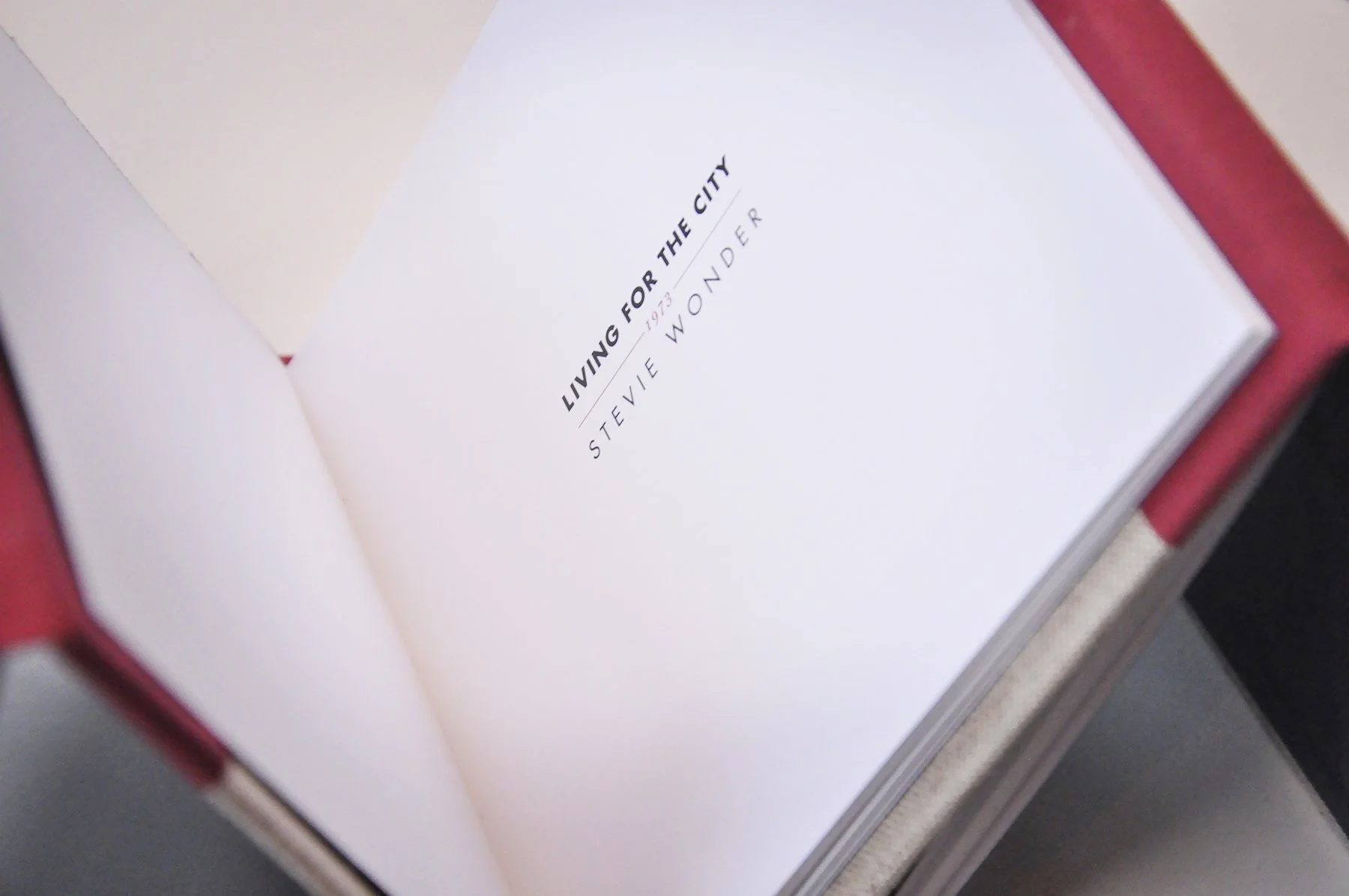
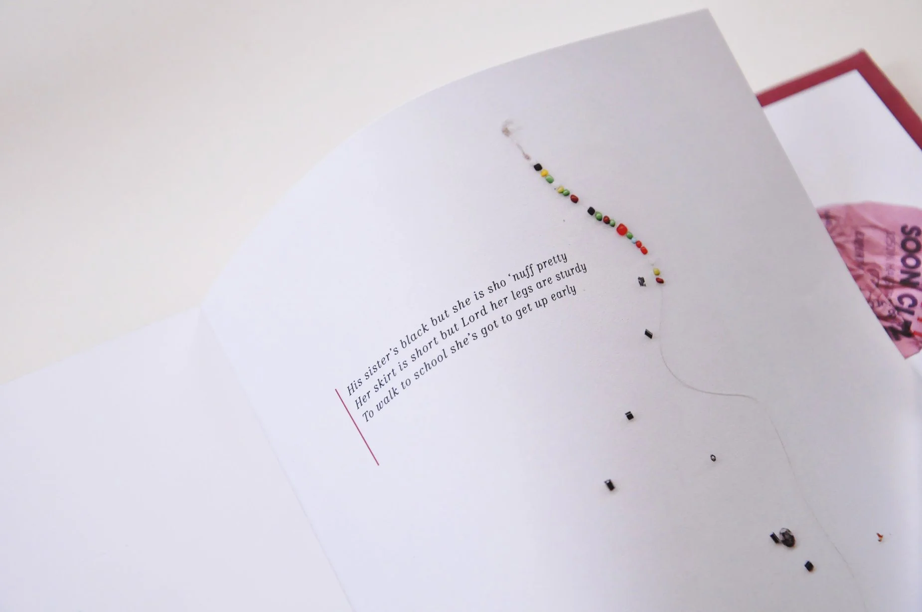
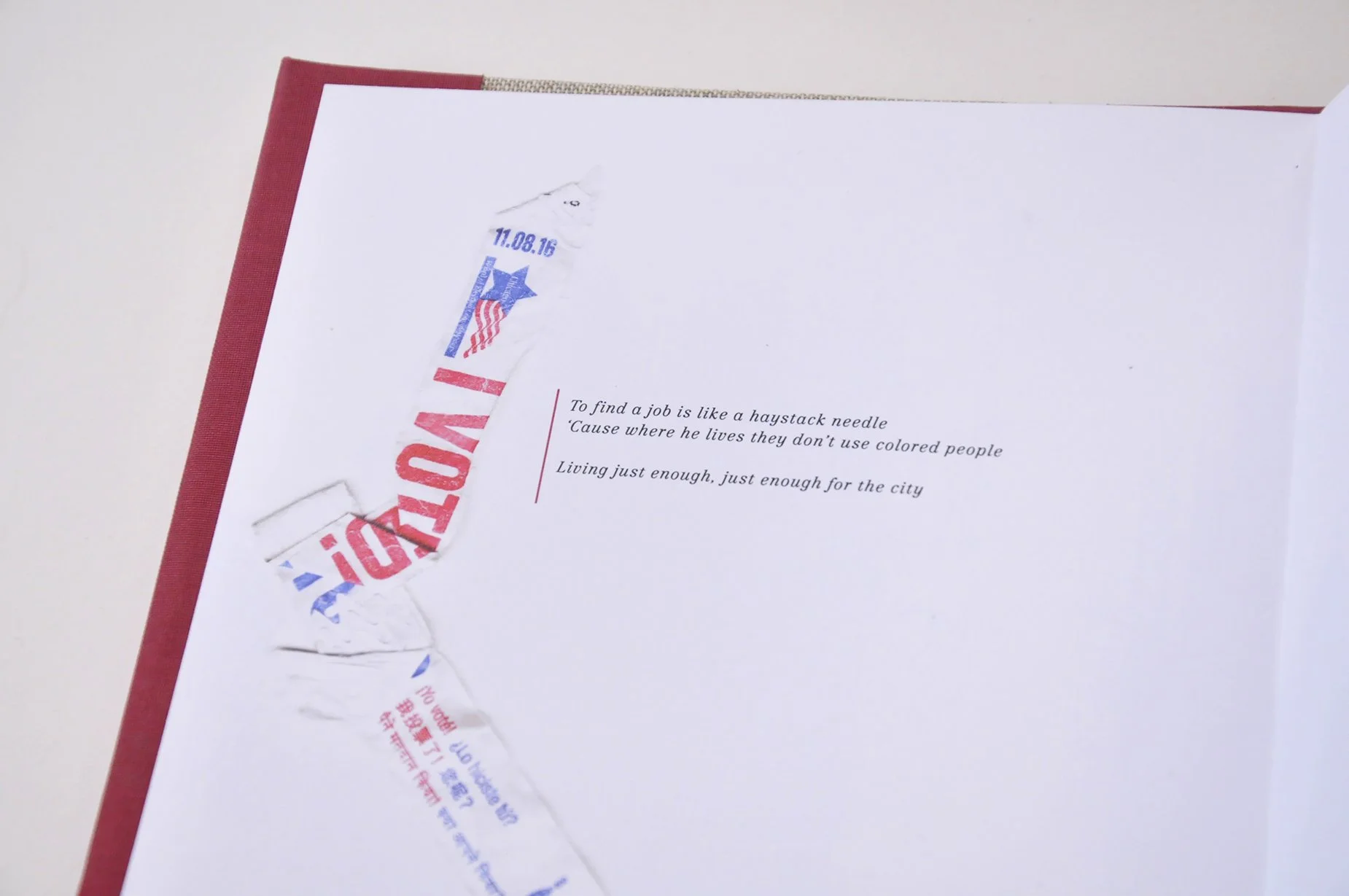
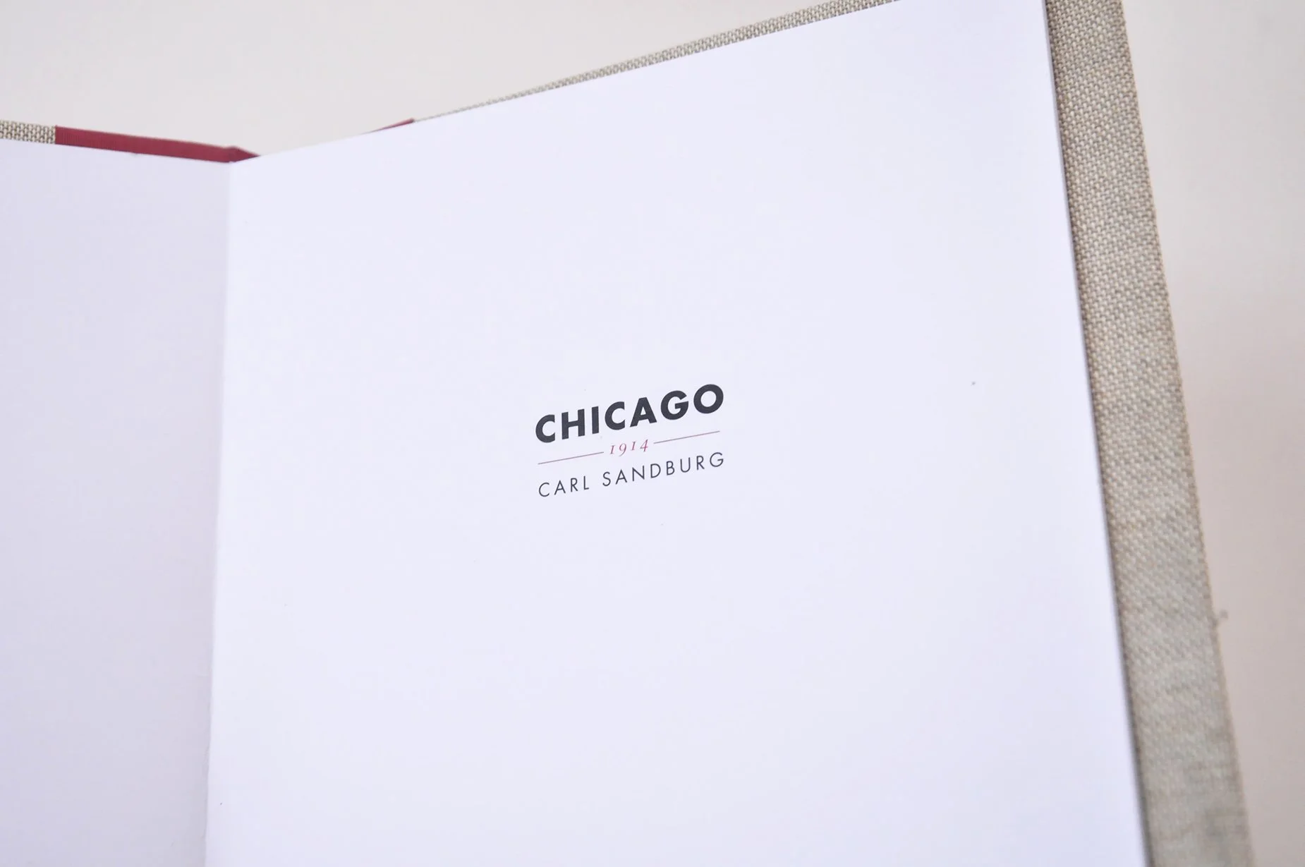
Living for the city
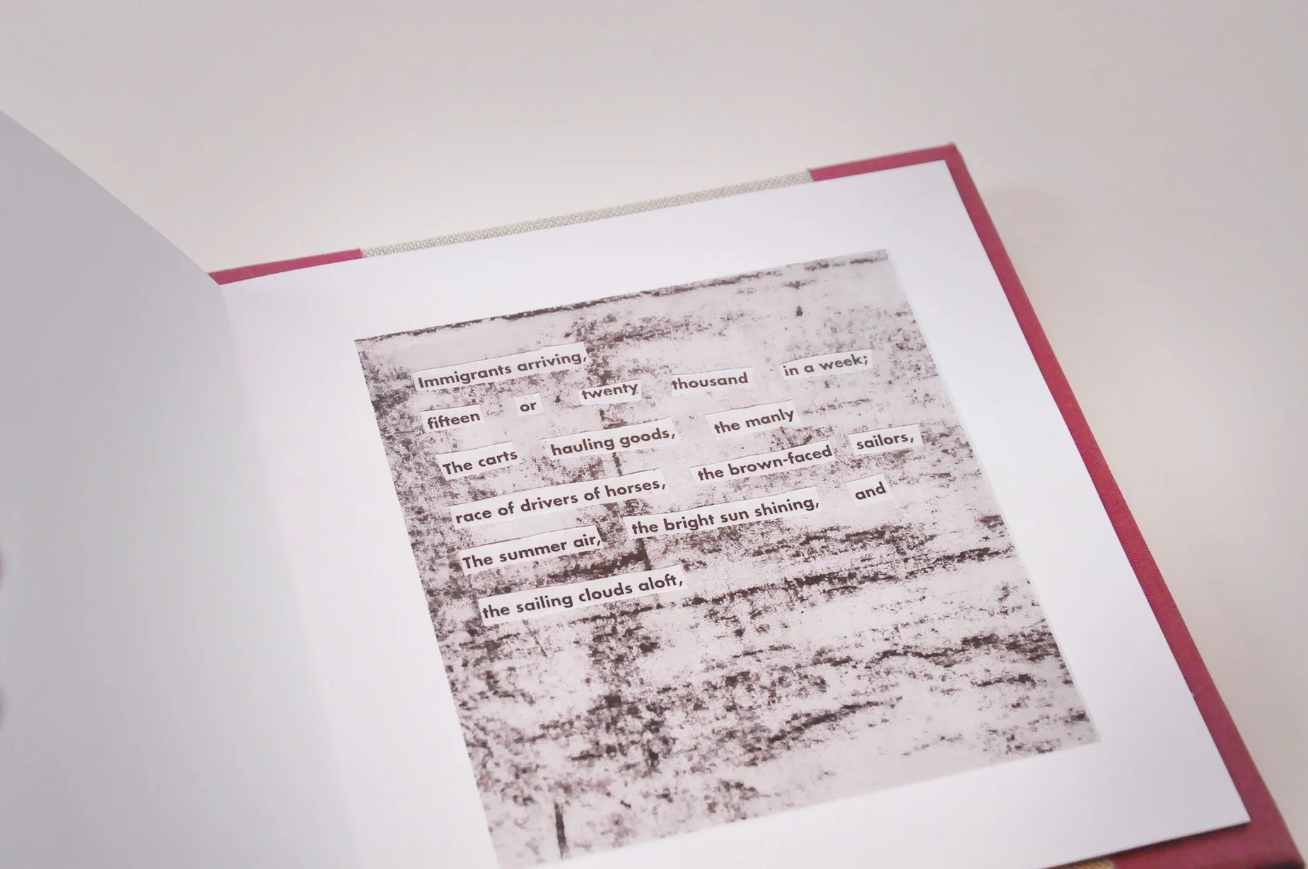
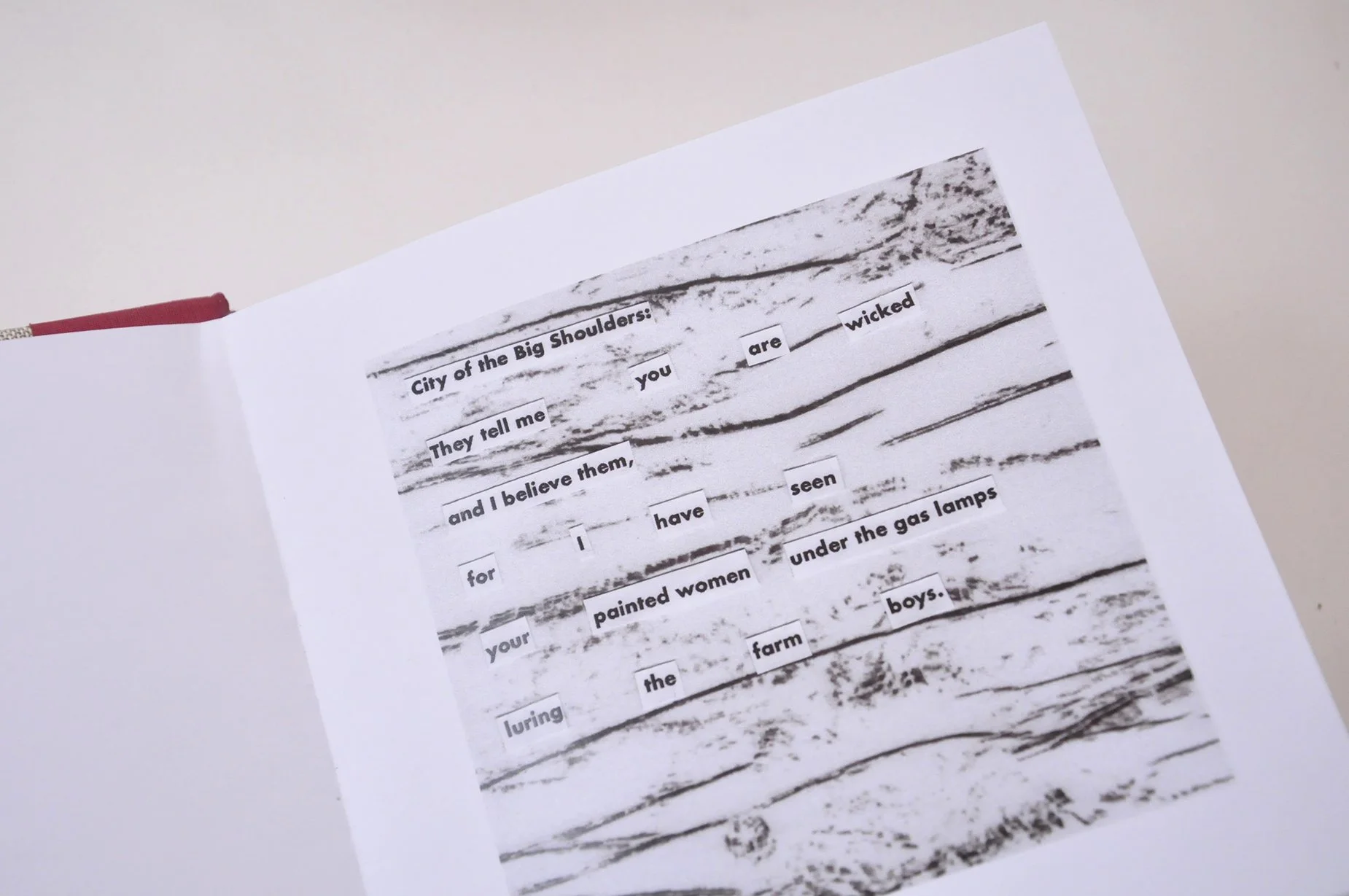
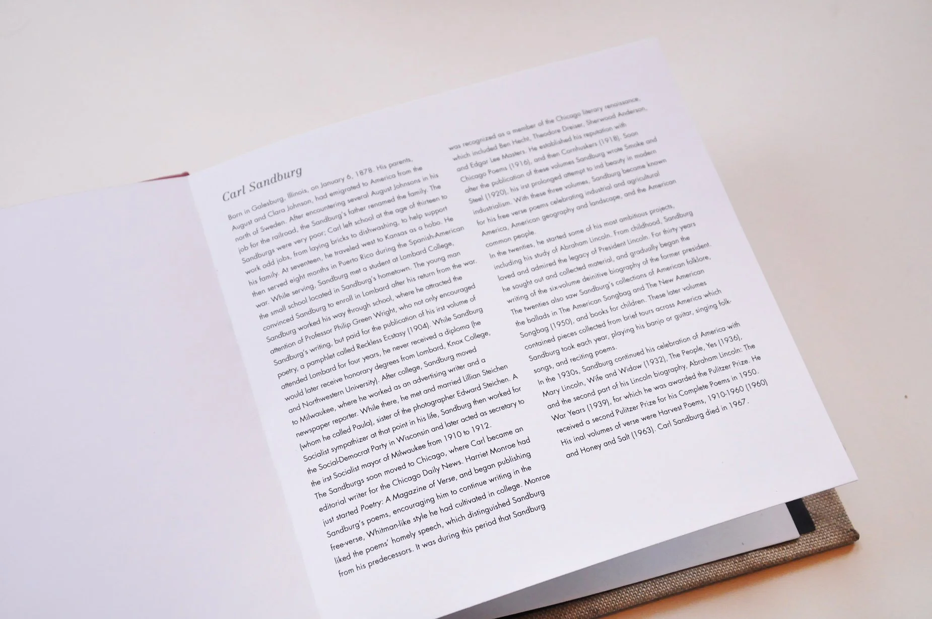
Writings by Walt Whitman, Carl Sandburg, and Stevie Wonder explore themes of urban life, though only one is titled "Living for the City." Whitman’s Mannahatta and Sandburg’s Chicago celebrate the vitality of their cities, despite acknowledging some hardships. These works, written by white men, highlight a more privileged perspective on city life. In contrast, Stevie Wonder’s song Living for the City delves into the harsh realities faced by a family of color struggling to survive in an urban environment.
To convey the differing experiences between privileged white individuals and people of color, I positioned Wonder’s song between the works of Whitman and Sandburg, oriented in the opposite direction. This arrangement illustrates the contrasting realities of city life, with Wonder’s perspective offering a stark counterpoint to the more idealized visions of urban living presented by Whitman and Sandburg.

History of type design
I envisioned the timeline as a subtle reference to a watch face, symbolizing the evolution of typography through time.
My aim was to inspire reflection not only on the history of typography but also on its future. To achieve this, I selected a contemporary typeface like Gotham, paired with a color palette inspired by Russian Constructivism, blending modernity with a nod to influential design movements of the past.
Film Poster Genre Shift
Though A Walk to Remember is widely regarded as a romantic drama, its narrative can be reimagined as a horror film, particularly when its tagline is viewed out of context: “She didn’t belong. She was misunderstood. And she would change his life forever.”
In my interpretation, I aimed to evoke a sense of unwanted captivity by incorporating visual elements such as the repetition of tiled flooring, tightly gripped hands, and unsettling, discolored skin tones. The tagline is positioned as a focal point, drawing the viewer's gaze to the space between the legs, where the misunderstood woman’s face emerges, gripping her victim’s ankles, symbolizing her inescapable hold on his fate.
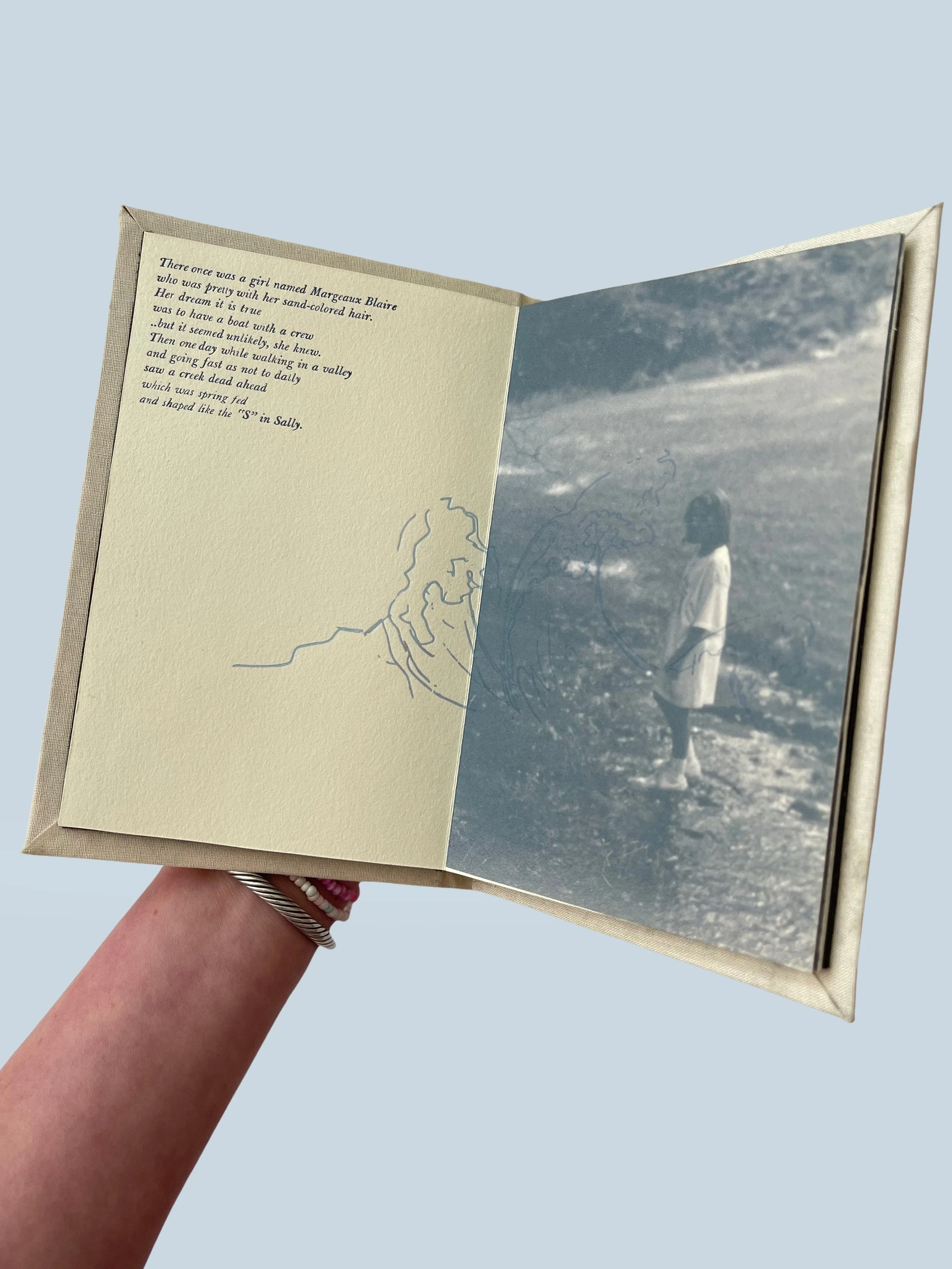
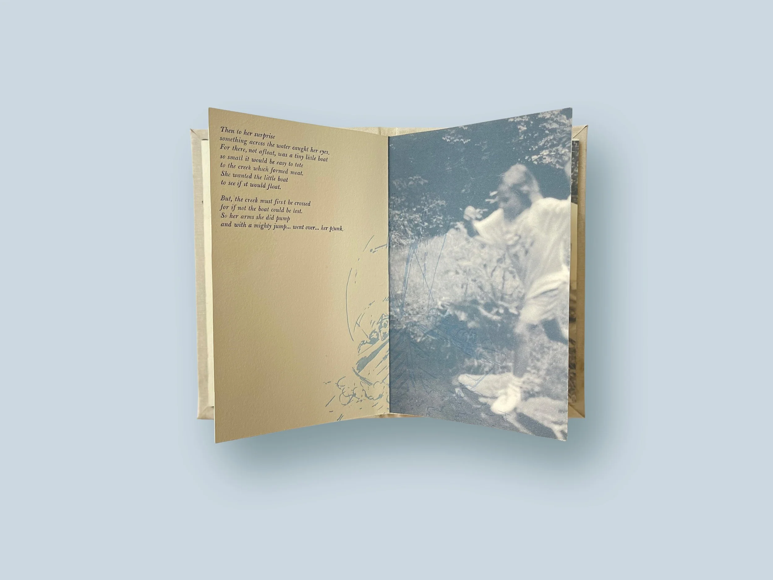
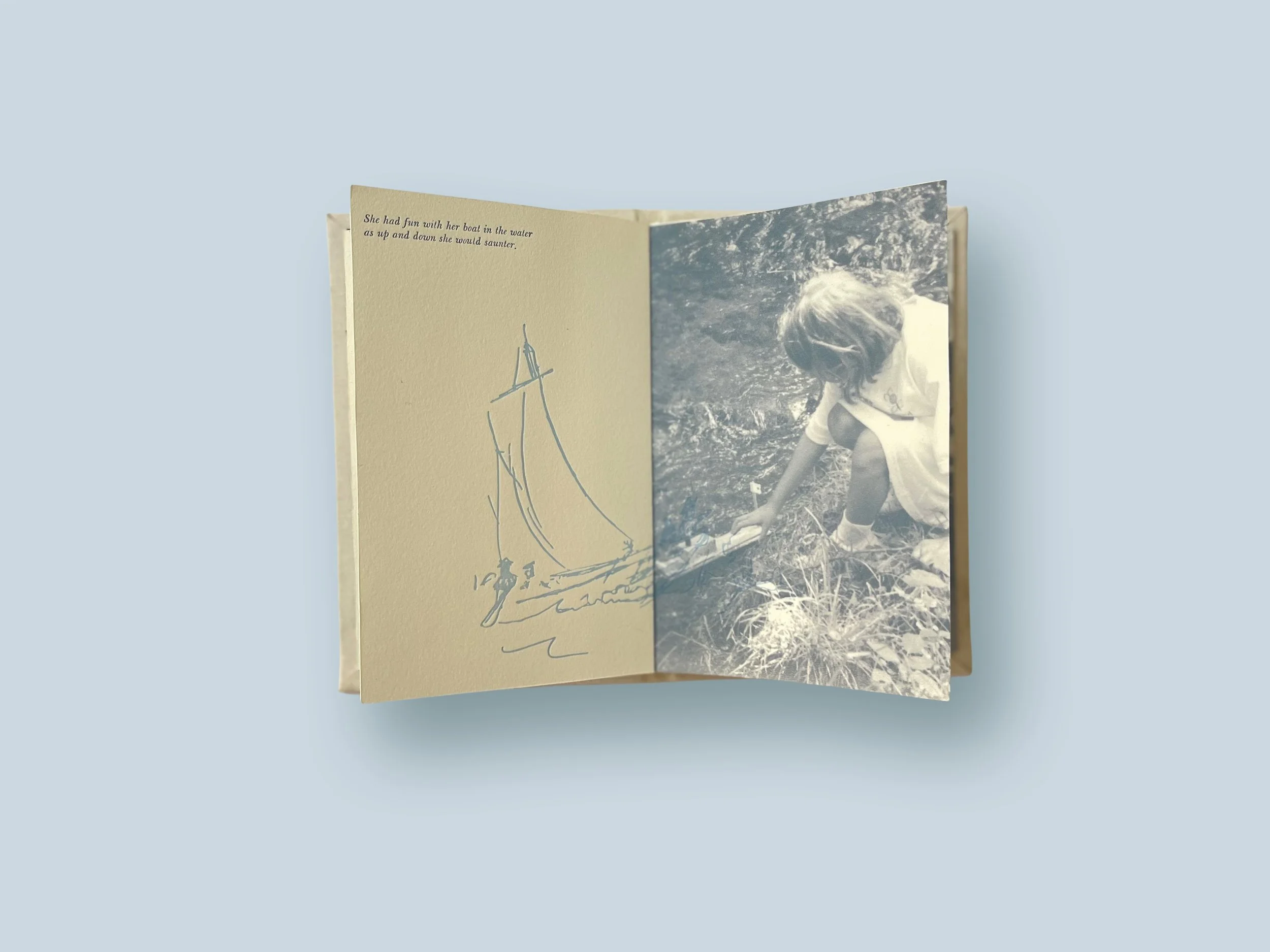
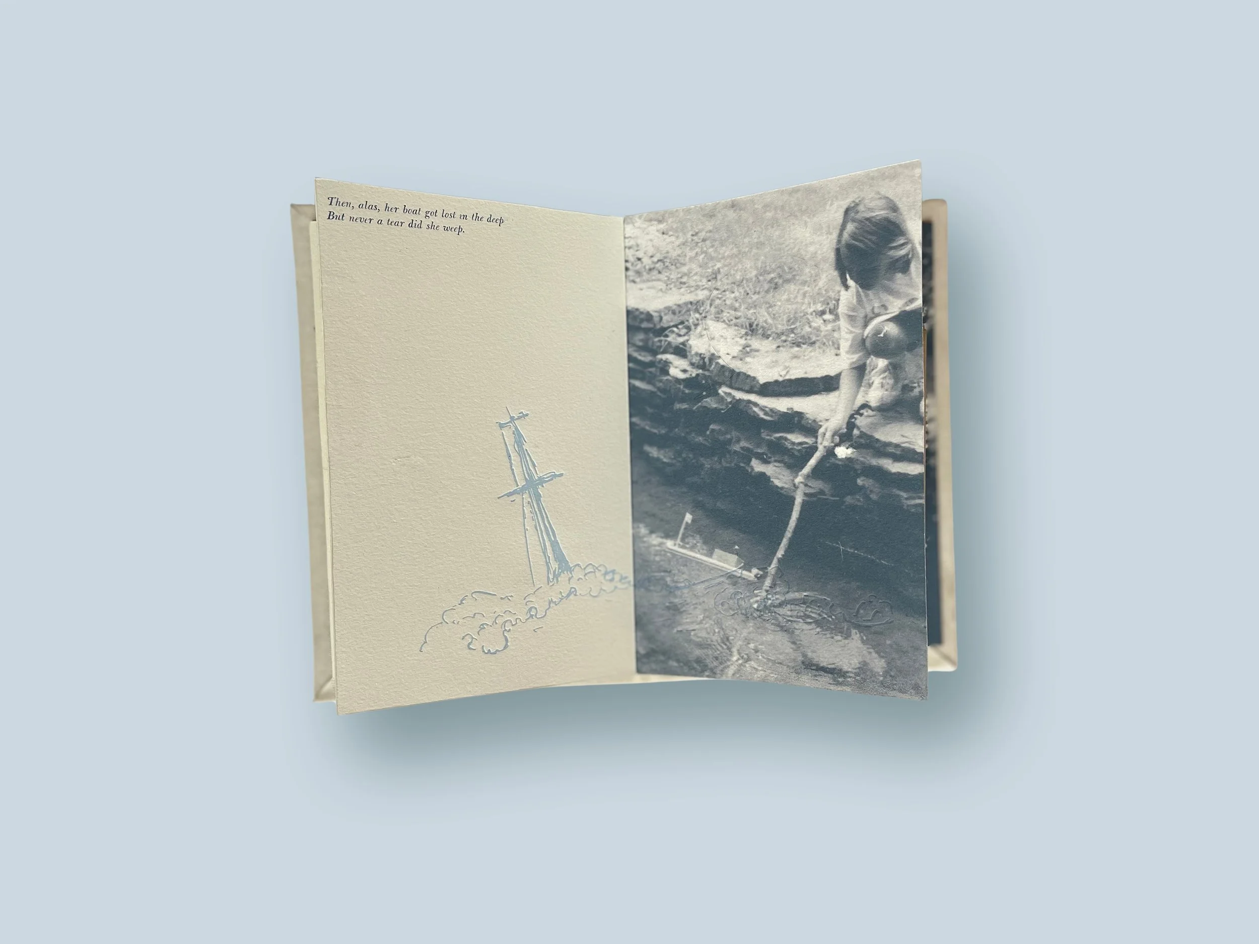
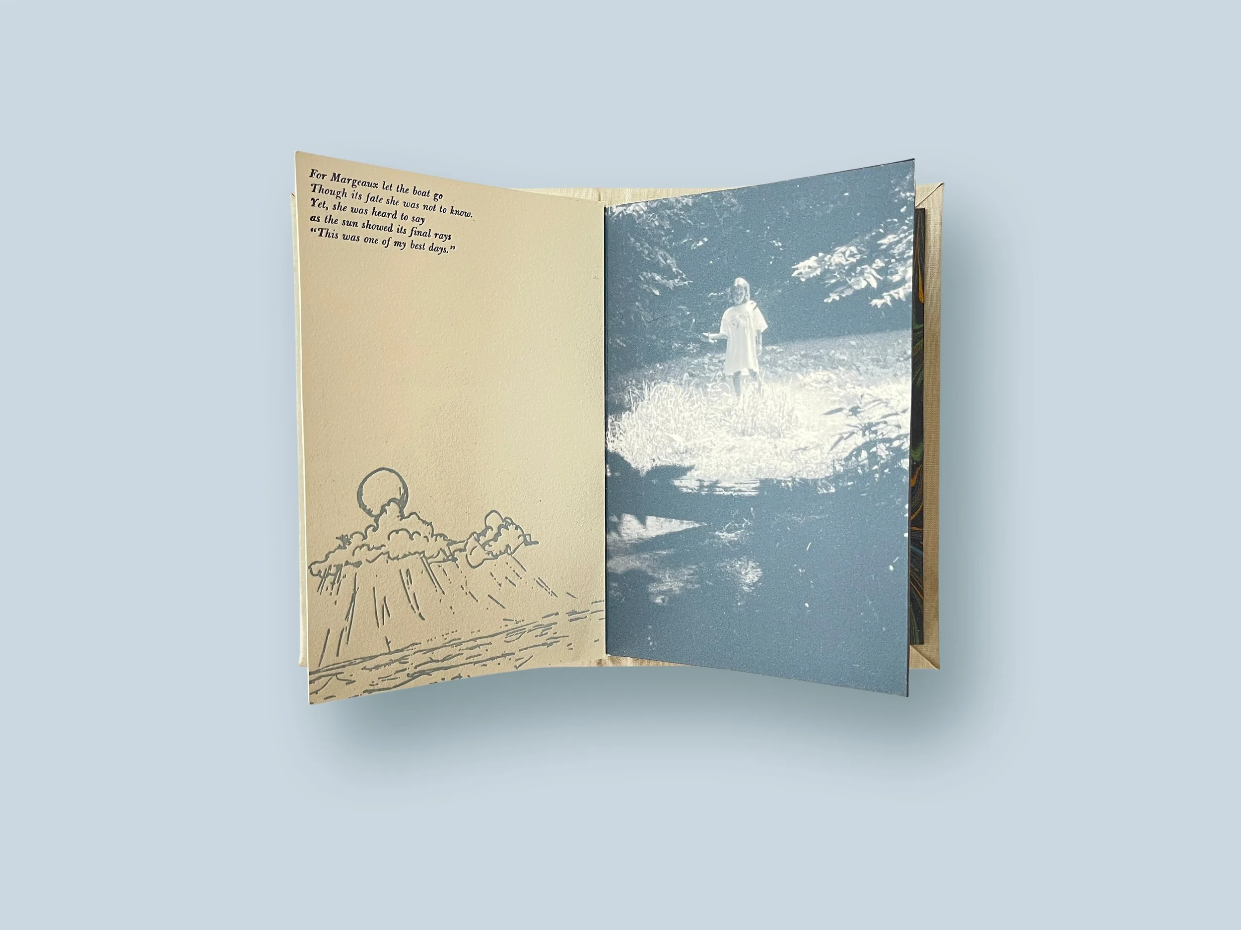
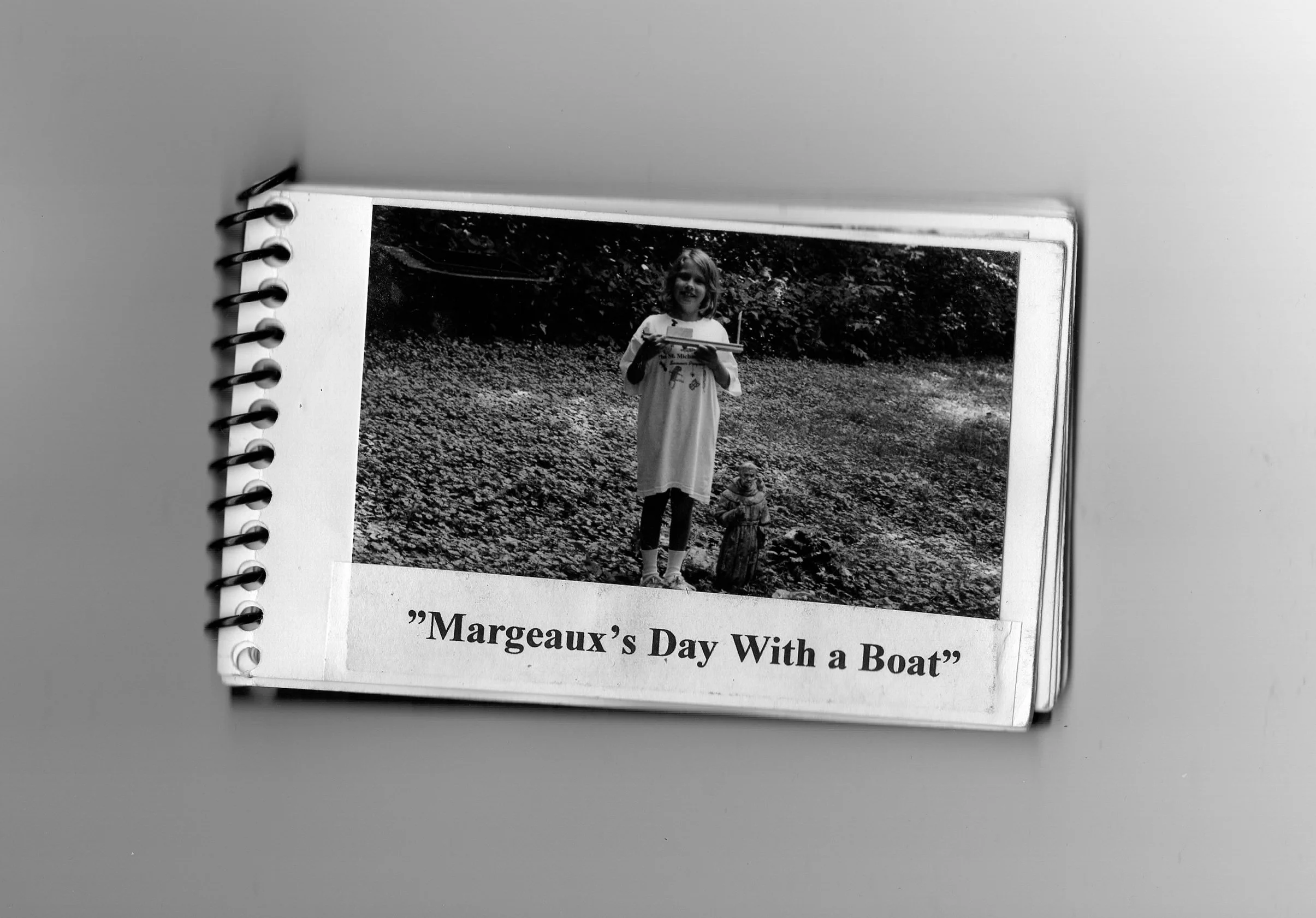
Margeaux’s Day with a boat
One of my passions is letterpress, particularly the charm of playing with type and appreciating the unique character of each letter as it wears down over time from use. I wanted to create a project to honor my grandfather, 'Papa Doc,' who was not only a talented photographer but also had a habit of turning our shared moments into small poetry books. One memory stands out—when I asked him to help me build a boat in his woodshop to sail on the creek behind his house. He gave me full creative freedom, likely knowing my attempt would fail, but he let me explore my creativity anyway.
Reflecting on his photos and writings, I realized he probably wrote them while imagining what was going on in my head during those moments. For this project, I overlaid images of a ship and crew on top of his photos, paired with his words, to visually capture "my imagination" during that day—trying to get my poorly built boat to float.